Every time a customer contacts Amazon, about a missing package, an unexpected charge, a return, a Customer Service Associate (CSA) opens a tool to help them. For years, that tool was a problem. This is the story of how my team redesigned it from scratch, and why it mattered to hundreds of thousands of people whose job it was to use it every single day.
A tool nobody owned and nobody questioned
Amazon handles hundreds of millions of customer contacts every year, by phone, chat, and email, across 23 marketplaces and 25 languages. The people doing that work are called Customer Service Associates, or CSAs. They are the human beings on the other end when something goes wrong with your order.
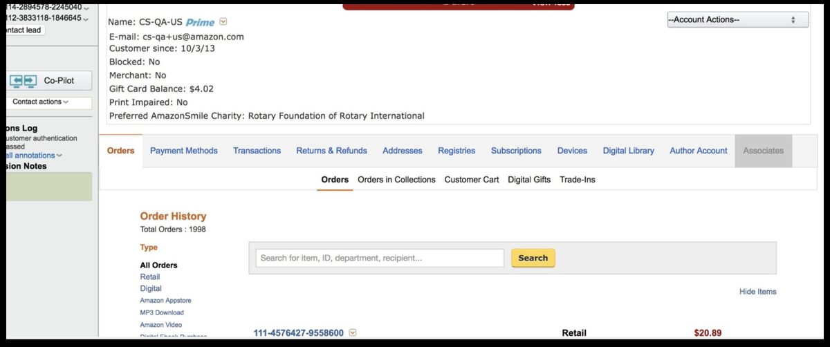
Before the Amazon Customer Care Center (AC3), those CSAs navigated a tool called Customer Service Central, a platform that had been patched and extended for over a decade by dozens of different teams, none of whom owned the experience end-to-end. It hadn't been rethought in years. Resolving a single contact meant drilling through multiple tabs, five levels deep, touching thirteen separate pieces of information, for a problem that should have taken thirty seconds.
There was no product team. No UX with a seat at the table. Operational leaders cut tickets that went straight into technical backlogs. Tech worked on them by severity. No verification of the problem. No questioning of the solution. UX was brought in after the fact to check it didn't look too bad.
The old tool, pre-AC3
Two questions nobody could answer
I started by asking leadership two questions. The answers told me everything I needed to know.
I started by asking two questions that nobody in leadership could answer with any confidence. Not because they were hard questions, but because nobody had asked them in a way that started with the customer.
The first: How do we know we are solving the most important problems? The second: Where do we want to be in three years?
I wrote a proposal to go see how associates actually worked, to sit beside them during real contacts, watch them navigate the tool, and understand what the job actually required. Site visits across the UK, USA, and Philippines. While those were being arranged, I ran weekly lunch-and-learns, listening to CSA calls with program, tech, ops, and UX in the room. And a standing observation session at a site five minutes from the office.
The goal wasn't just research. It was to build a shared sense of purpose across every discipline that would need to help solve the problem.
We watched. We listened. We followed the workarounds.
Across every site I visited, Seattle, the Philippines, the UK, I saw the same thing play out. Multiple times a day, with every associate I sat beside. The work of helping a customer is emotionally demanding. These were people who genuinely cared. But the tool was fighting them at every turn.
A "contact" in Amazon CS language is a single customer interaction, one phone call, one chat session. Here's one contact I observed. It's not dramatic. That's the point.
Customer service is hard. It requires real empathy and emotional endurance. The associates I observed had all of that. What they didn't have was a tool that let them use it.
After 350+ listen-ins (recorded or live customer calls), 30+ interview sessions, and over 1,000 survey responses, the scale of the problem was undeniable.
People often describe a "steep learning curve" as something hard. It isn't, steep means you learn fast. What I was looking at was a slow learning curve: three to four months to reach basic proficiency. I measured it two ways, self-reported confidence and actual performance data, and the curves matched almost exactly.
The root cause: high cognitive load left no room to learn. Associates were constantly searching, collecting fragments, assembling a solution in their heads, leaving nothing for actually connecting with the customer. The job itself is genuinely hard. The system was making it harder for no good reason. That was the opportunity.
No surprises. No magic from a box.
With the research in hand, I ran a modified Design Sprint, a structured workshop format for aligning cross-functional teams on problems and directions quickly, Operations, Product, Technical, and CSA representatives in the room. Not a presentation. A working session where everyone shaped the direction together. The four principles we aligned on became the design brief.
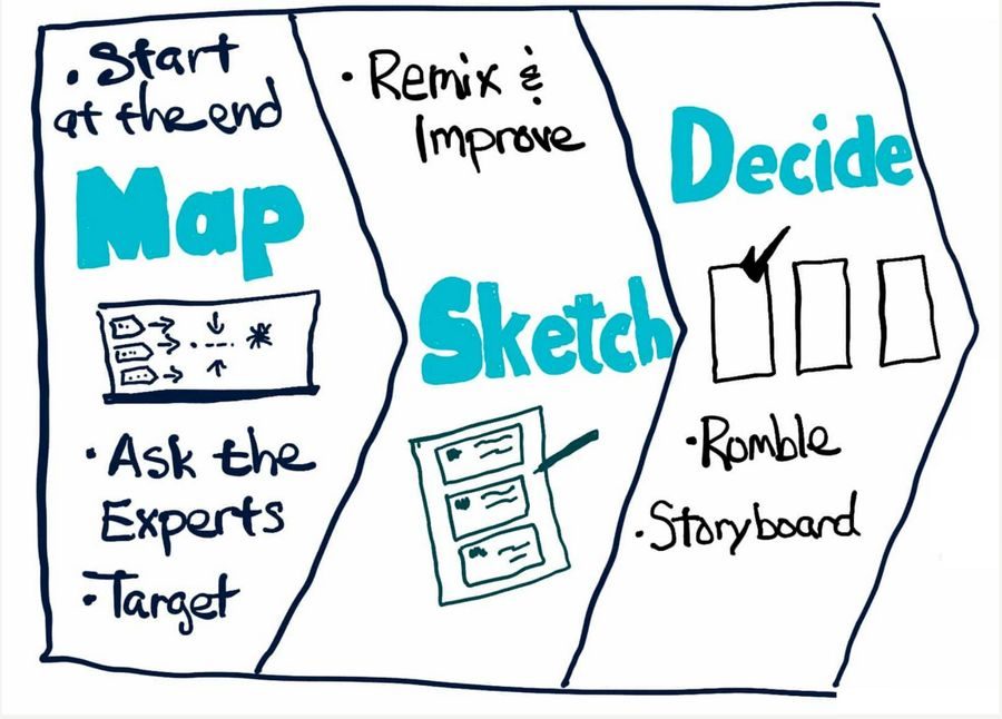
Design Sprint, ops, product, engineering, and CSAs in the room together
The four principles we aligned on became the design brief.
I also established twice-weekly working sessions, open to all disciplines to observe. The goal was trust. No surprises. No UX going into a box and coming out with a magic solution.
Start mild. Move toward wild.
My approach: start mild, move toward wild. Could the problem be solved with minimal changes to existing infrastructure? I wanted evidence before proposing anything radical, leadership had real concern about abandoning a tool teams had built years of process around. So we started with deviate: same look and feel, same structure, but with order cards surfaced at the top.
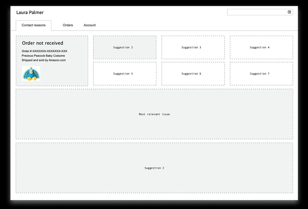
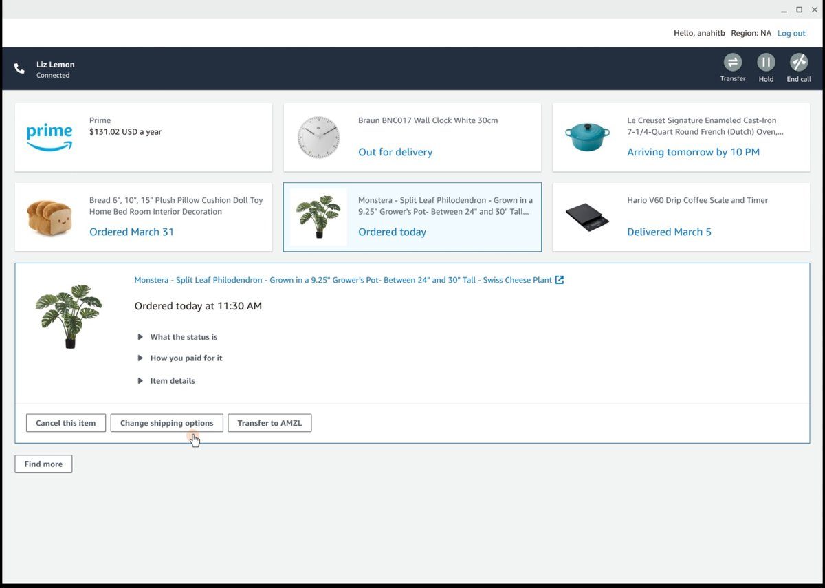
Order cards put the thing the customer was contacting about right upfront. Click a card, get a view that pulls together everything relevant to that thing and the actions available. One interaction instead of six tabs.
Deviate, existing tool structure preserved, order cards introduced at the top
But order cards had a fundamental flaw: order numbers are convenient for Amazon, not for customers. Customers don't say order numbers. They say "the boots I ordered" or "that charge on my Visa." The card needed to evolve, from representing an order to representing an entity. The thing itself.
The thing the customer is talking about
The central design challenge: a match card needed to be flexible enough to represent any entity, an order, a subscription, a charge, a device, but rigid enough that a CSA always knew where to look. Predictability was the whole point. Learn one card, know all of them. That's how you compress weeks of training into hours.
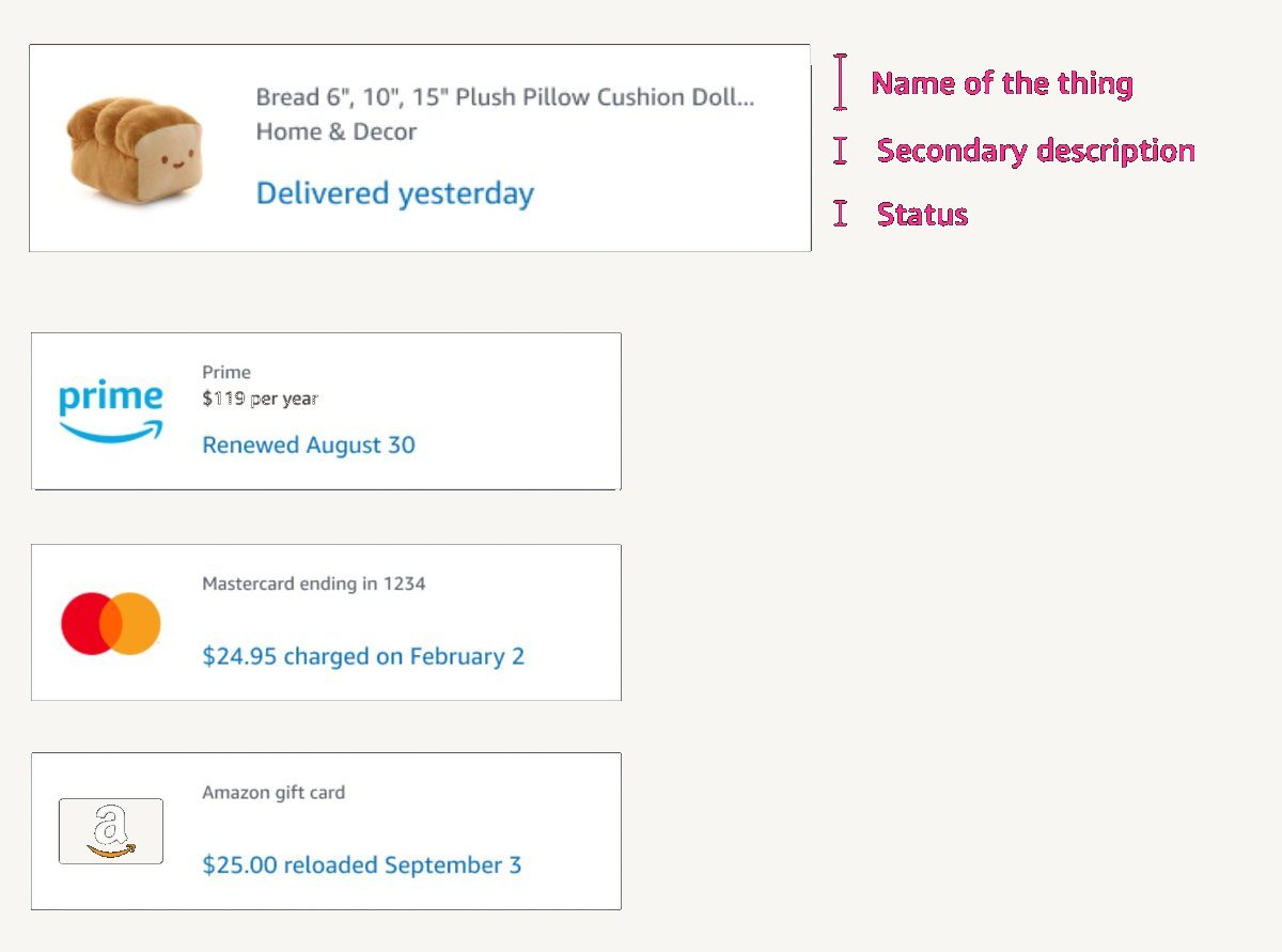
Four entity types, one anatomy, same fields in the same position on every card
The architecture was simple: match cards at the top, CSA selects one, solve panel opens below. Two states, one interaction.
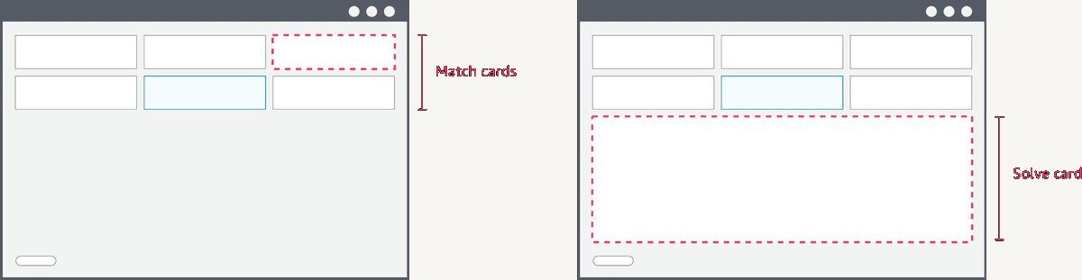
Select a match card → solve panel opens below
The solve panel surfaced informational solves (answers to the customer's question) and action solves (things you can do on their behalf), in a predictable layout, every time. No hunting across tabs. No manual assembly.
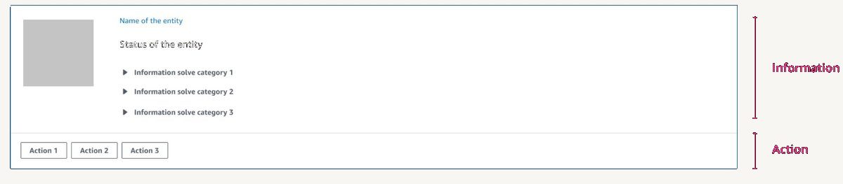
Informational solves above the line. Action solves below. Same every time.
Early versions surfaced everything at once, too much, no hierarchy. Participants didn't know where to look from card to card. Many rounds of iteration to find the right anatomy.
Iteration, wireframe explorations through to entity-based match cards
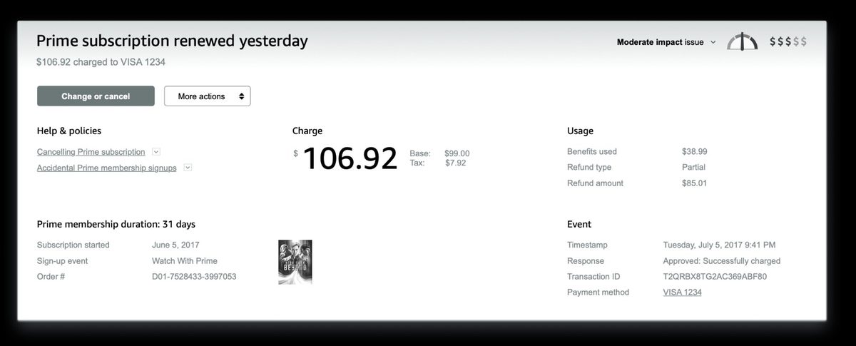
Solve panel, charge confirmed, refund options and policy surfaced inline
The model didn't come from a whiteboard. It emerged from the combination of site visit observations and early prototype testing. Watching associates work, then watching them use early prototypes, the same pattern kept surfacing: regardless of contact type, every associate did the same three things in the same order. The tool either helped or got in the way. Naming that sequence gave every discipline a shared language for every decision that followed.
Fresh off the street. No training. Just help a customer.
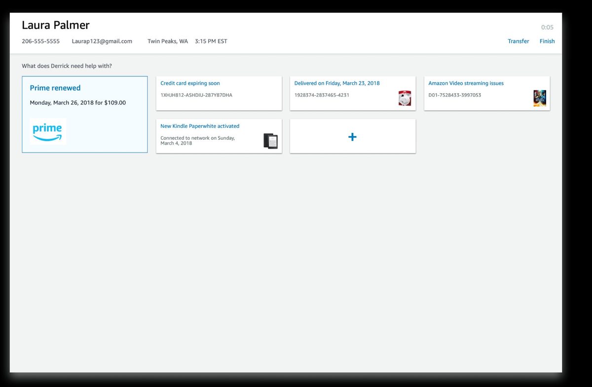
Qualitative research had pointed clearly in one direction. But leadership wanted physiological proof, something undeniable. We ran a biometric study using eye tracking and galvanic skin response (GSR, a measure of physiological stress through skin conductance). Participants with zero training on either tool. Told simply: help these customers.
Most participants couldn't finish the task using the old tool. Almost all completed it with AC3, across five different contact scenarios. The stress difference wasn't subjective. It was measurable.
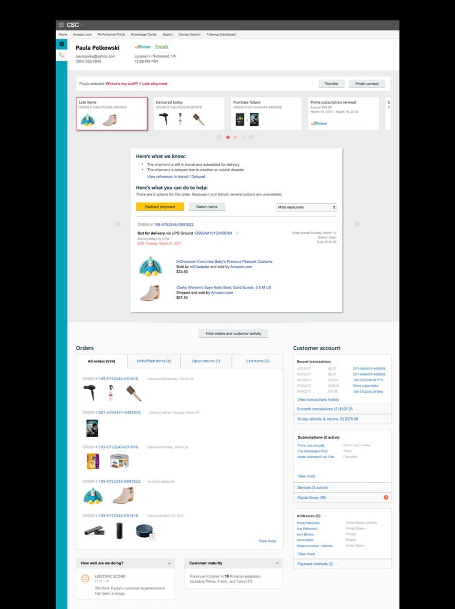
AC3 during testing, match cards surfaced immediately, solve panel open below
All values relative to old tool baseline
Eye tracking + GSR · untrained participants · 5 contact scenarios
All values relative to old tool baseline
The numbers that unlocked everything
The proof of concept (POC), a limited working version tested with real CSAs on real contacts, was validated on two of Amazon's highest-volume contact types: "Where's my stuff?" and "Why was I charged this?" Common enough to get findings fast. Complex enough to stress-test the model. The results were unambiguous. Leadership approved full investment to migrate the entire global CS operation to AC3. That story is in the Scaling Amazon Customer Care Center case study.